
Layout
Structure decides what gets read
Three layouts, grouped collections and an optional jump menu. These are the least glamorous settings on the page and the ones with the largest effect on where clicks land.
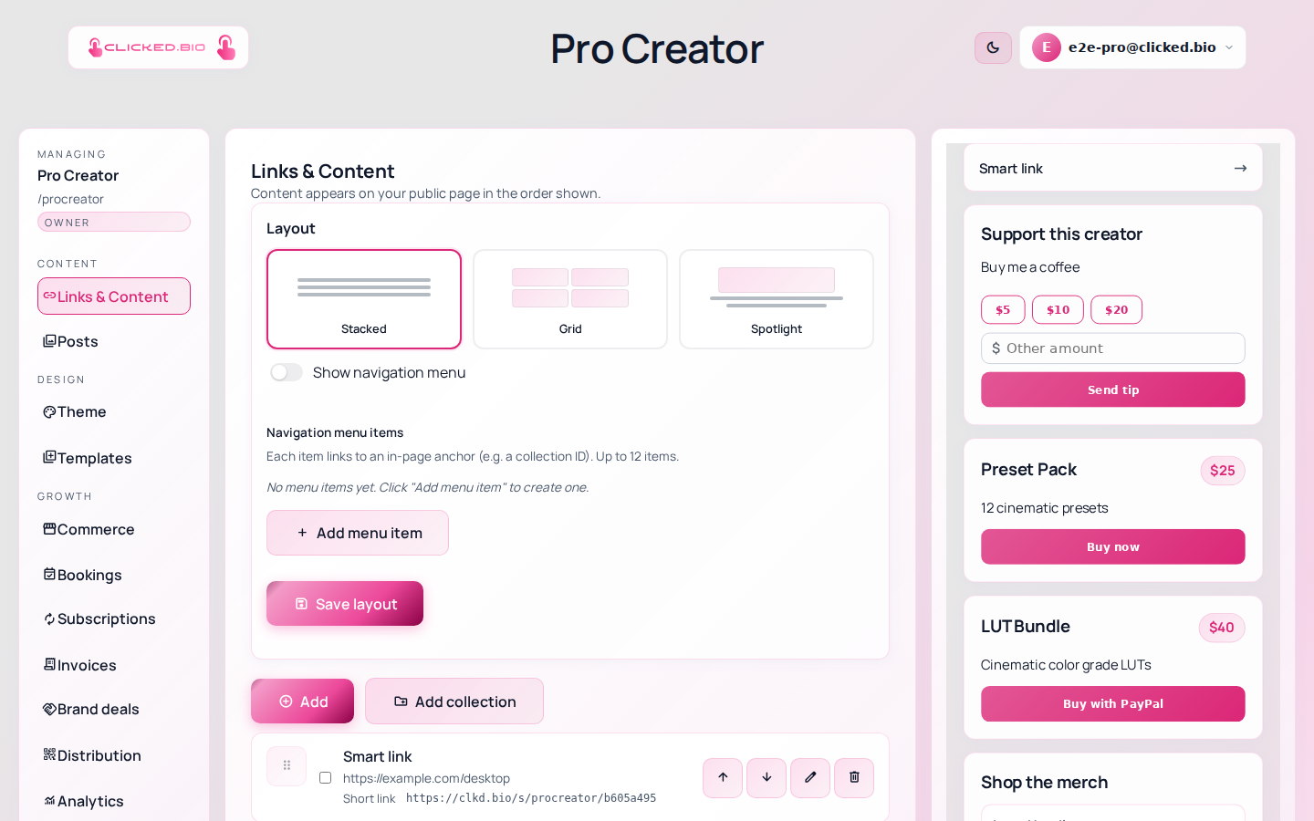
| Layout | Shape | Choose it when |
|---|---|---|
| Stacked | One full-width block per row | Default. Easiest to read on a phone. |
| Grid | Two per row | You have many equal options to browse. |
| Spotlight | One block featured, rest below | There is genuinely one thing you want clicked. |
Collections and the jump menu
Collections group blocks under a heading, which is what you want when your links split into obvious groups — "watch", "shop", "book me".
The navigation menu adds up to twelve jump links to sections of the page. It earns its place once you are past about eight blocks and gets in the way before that.
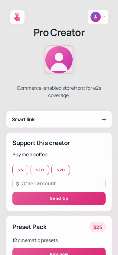
Reordering beats adding. The first block gets far more clicks than the fourth, so promoting this week's thing works better than publishing another link for it.
Layouts, collections and the menu are on every plan including Free. See pricing.
Common questions
How many links is too many?
There is no hard limit and there is a practical one. Past six or seven, each additional link mostly takes clicks from the others.
Can different pages use different layouts?
Yes — layout is per page, so a shop page and a booking page can be shaped differently.